Ionic still supports custom SVG icons directly in ion-icon, so you can mix your own artwork with the built-in Ionicons set.
In a current Ionic and Angular project, the simplest setup is to place the SVG files under src/assets. The Angular build copies that folder to the generated app.
"assets": ["src/assets"],
The sample app uses a standalone page component that imports the Ionic components it needs.
import { ChangeDetectionStrategy, Component } from '@angular/core';
import { IonButton, IonContent, IonHeader, IonIcon, IonTitle, IonToolbar } from '@ionic/angular';

@Component({
  changeDetection: ChangeDetectionStrategy.Eager,
  selector: 'app-home',
  templateUrl: './home.page.html',
  styleUrl: './home.page.scss',
  imports: [IonHeader, IonToolbar, IonTitle, IonContent, IonButton, IonIcon],
})
export class HomePage {
  readonly embeddedPhoneIcon =
    'data:image/svg+xml;utf8,<svg version="1.1" xmlns="http://www.w3.org/2000/svg" width="512" height="512" viewBox="0 0 512 512"><path d="M384 0h-288c-17.6 0-32 14.399-32 32v448c0 17.6 14.399 32 32 32h288c17.6 0 32-14.4 32-32v-448c0-17.601-14.4-32-32-32zM240 488.891c-13.746 0-24.891-11.145-24.891-24.891s11.145-24.891 24.891-24.891 24.891 11.145 24.891 24.891-11.145 24.891-24.891 24.891zM384 416h-288v-352h288v352z"></path></svg>';
}
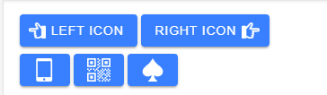
To render a custom icon, point the src input of ion-icon to the SVG file. The same approach works for start and end icons inside buttons.
  <ion-button>
    <ion-icon aria-hidden="true" slot="start" src="assets/point-left.svg" />
    Left Icon
  </ion-button>

  <ion-button>
    Right Icon
    <ion-icon aria-hidden="true" slot="end" src="assets/point-right.svg" />
  </ion-button>
For icon-only buttons, add an aria-label to the button and mark the icon as decorative with aria-hidden="true".
  <ion-button aria-label="Open mobile actions">
    <ion-icon aria-hidden="true" slot="icon-only" src="assets/mobile.svg" />
  </ion-button>
  <ion-button aria-label="Show QR code">
    <ion-icon aria-hidden="true" slot="icon-only" src="assets/qrcode.svg" />
  </ion-button>
  <ion-button aria-label="Open card game">
    <ion-icon aria-hidden="true" slot="icon-only" src="assets/spades.svg" />
  </ion-button>
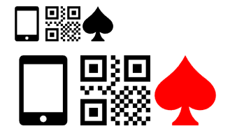
Custom SVG icons can be styled like any other ion-icon. In current Ionic projects, font-size and color are the most convenient properties for scaling and tinting the icon.
ion-icon {
  &.big {
    font-size: 48px;
  }

  &.bigger {
    font-size: 96px;
  }

  &.red {
    color: var(--ion-color-danger);
  }
}
The example template also uses Ionic utility classes such as ion-padding and ion-margin-top, which keeps the markup straightforward.
  <div class="ion-margin-top">
    <ion-icon aria-hidden="true" class="big" src="assets/mobile.svg" />
    <ion-icon aria-hidden="true" class="big" src="assets/qrcode.svg" />
    <ion-icon aria-hidden="true" class="big" src="assets/spades.svg" />
  </div>

  <div class="ion-margin-top">
    <ion-icon aria-hidden="true" class="bigger" src="assets/mobile.svg" />
    <ion-icon aria-hidden="true" class="bigger" src="assets/qrcode.svg" />
    <ion-icon aria-hidden="true" class="bigger red" src="assets/spades.svg" />
  </div>
If you want to keep an icon self-contained, bind a data URL from the component class and pass it to ion-icon with property binding.
  readonly embeddedPhoneIcon =
    'data:image/svg+xml;utf8,<svg version="1.1" xmlns="http://www.w3.org/2000/svg" width="512" height="512" viewBox="0 0 512 512"><path d="M384 0h-288c-17.6 0-32 14.399-32 32v448c0 17.6 14.399 32 32 32h288c17.6 0 32-14.4 32-32v-448c0-17.601-14.4-32-32-32zM240 488.891c-13.746 0-24.891-11.145-24.891-24.891s11.145-24.891 24.891-24.891 24.891 11.145 24.891 24.891-11.145 24.891-24.891 24.891zM384 416h-288v-352h288v352z"></path></svg>';
<ion-icon aria-hidden="true" class="big" [src]="embeddedPhoneIcon" />
The src input behaves like an image URL, so the resource has to be reachable by the app and it must contain valid SVG markup.
You can find the source code for this example on GitHub.