When you generate an Ionic application with the Ionic CLI, the project already includes Ionicons. That is a good default, but many applications need a larger catalog or a different visual style. In this post, I show how to use Font Awesome in a modern standalone Angular and Ionic application.
Font Awesome ships official packages for several frontend frameworks, including Angular, React, and Vue. Here I focus on the Angular integration.
Setup 
Install the Angular wrapper, the shared SVG core package, and the icon sets you want to use:
npm install @fortawesome/angular-fontawesome @fortawesome/fontawesome-svg-core @fortawesome/free-brands-svg-icons @fortawesome/free-regular-svg-icons @fortawesome/free-solid-svg-icons
The free packages give you access to the brands, regular, and solid icon sets. Use the Font Awesome icon gallery to check whether an icon is available in the free tier or requires a Pro license. If you use Pro icons, switch the package imports to your licensed kit or Pro packages.
Usage 
The Angular integration supports two patterns that cover most use cases: explicit references inside a component and a shared icon library.
Explicit reference 
For icons that are only used in one component, importing the icon object directly keeps everything local and easy to understand.
Import the icons and expose them as component properties.
  readonly faHandPointLeft = faHandPointLeft;
  readonly faHandPointRight = faHandPointRight;
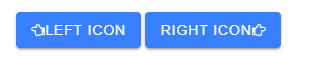
Reference those properties from the template with the fa-icon component.
  <ion-button>
    <fa-icon [icon]="faHandPointLeft" slot="start" />
    Left Icon
  </ion-button>

  <ion-button>
    Right Icon
    <fa-icon [icon]="faHandPointRight" slot="end" />
  </ion-button>
Shared library 
If the same icons appear in multiple components, register them once in FaIconLibrary. The icons are then available anywhere in the application by name.
Import the icons you want to share and inject FaIconLibrary in the root component.
export class AppComponent {
  private readonly library = inject(FaIconLibrary);
This example registers individual icons with addIcons(). You can also import an entire pack with addIconPacks(), but that usually increases the bundle size because it disables tree-shaking for that pack.
// import {fas} from '@fortawesome/free-solid-svg-icons';
@Component({
  selector: 'app-root',
  templateUrl: './app.component.html',
  imports: [IonApp, IonRouterOutlet],
})
export class AppComponent {
  private readonly library = inject(FaIconLibrary);

  constructor() {
    // library.addIconPacks(fas);
    this.library.addIcons(
      faSmileWinkSolid,
      faSmileBeamSolid,
      faSmileWink,
      faSmileBeam,
      faEnvelopeOpen,
      faCloud,
      faMobile,
      faSquare,
      faSpinner,
      faCircle,
      faSync,
      faPlay,
      faSun,
      faMoon,
      faStar,
      faHandPointLeft,
      faAsterisk,
      faCog,
      faSkating,
      faSkiing,
      faSkiingNordic,
      faSnowboarding,
      faSwimmer,
      faSolidBell,
      faRegularBell,
      faCamera,
      faBan,
    );
Once an icon is in the library, you can reference it by name in the template. Removing the fa prefix and converting camel case to dashes gives you the template name. For example, faSmileWink becomes smile-wink.
  <div>
    <fa-icon icon="smile-wink" />
    <fa-icon icon="smile-beam" />

    <fa-icon [icon]="['far', 'smile-wink']" />
    <fa-icon [icon]="['far', 'smile-beam']" />
  </div>
If you omit the prefix, Angular Font Awesome assumes the solid set (fas). To use an icon from another set, specify the prefix explicitly.

Supported prefixes:
far= regularfas= solidfal= lightfab= brands
If your application mostly uses another set, inject FaConfig and change defaultPrefix.
import {inject} from '@angular/core';
import {FaConfig} from '@fortawesome/angular-fontawesome';

export class AppComponent {
  private readonly config = inject(FaConfig);

  constructor() {
    this.config.defaultPrefix = 'far';
  }
}
Features 
Angular Font Awesome supports the same building blocks as the SVG+JS integration, so you can resize, rotate, animate, stack, mask, and style icons directly from Angular templates.
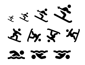
The following template shows size, rotation, and flip options.
  <div>
    <fa-icon [icon]="['fas', 'skiing']" size="lg" />
    <fa-icon [icon]="['fas', 'skiing']" size="2x" />
    <fa-icon [icon]="['fas', 'skiing']" size="3x" />
    <fa-icon [icon]="['fas', 'skiing']" size="4x" />
  </div>
  <div>
    <fa-icon [icon]="['fas', 'snowboarding']" size="3x" />
    <fa-icon [icon]="['fas', 'snowboarding']" [rotate]="90" size="3x" />
    <fa-icon [icon]="['fas', 'snowboarding']" [rotate]="180" size="3x" />
    <fa-icon [icon]="['fas', 'snowboarding']" [rotate]="270" size="3x" />
  </div>
  <div>
    <fa-icon [icon]="['fas', 'swimmer']" flip="horizontal" size="3x" />
    <fa-icon [icon]="['fas', 'swimmer']" flip="vertical" size="3x" />
    <fa-icon [icon]="['fas', 'swimmer']" flip="both" size="3x" />
  </div>
You can also bind the transform input dynamically.
  <div>
    <fa-icon [icon]="['fas', 'hand-point-left']" [transform]="magicTransform()" size="5x" />
    <input
      (input)="updateMagicLevel($event)"
      [value]="magicLevel()"
      max="360"
      min="0"
      type="range"
    />
  updateMagicLevel(event: Event): void {
    const magicLevel = Number((event.target as HTMLInputElement).value);
    this.magicLevel.set(magicLevel);
    this.magicTransform.set(`rotate-${magicLevel}`);
  }

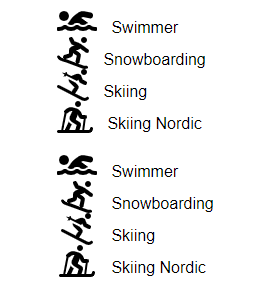
If you need icons to line up vertically, set fixedWidth to true.
  <div>
    <ul>
      <li>
        <fa-icon [icon]="['fas', 'swimmer']" size="2x" />
        Swimmer
      </li>
      <li>
        <fa-icon [icon]="['fas', 'snowboarding']" size="2x" />
        Snowboarding
      </li>
      <li>
        <fa-icon [icon]="['fas', 'skiing']" size="2x" />
        Skiing
      </li>
      <li>
        <fa-icon [icon]="['fas', 'skiing-nordic']" size="2x" />
        Skiing Nordic
      </li>
    </ul>
    <ul>
      <li>
        <fa-icon [fixedWidth]="true" [icon]="['fas', 'swimmer']" size="2x" />
        Swimmer
      </li>
      <li>
        <fa-icon [fixedWidth]="true" [icon]="['fas', 'snowboarding']" size="2x" />
        Snowboarding
      </li>
      <li>
        <fa-icon [fixedWidth]="true" [icon]="['fas', 'skiing']" size="2x" />
        Skiing
      </li>
      <li>
        <fa-icon [fixedWidth]="true" [icon]="['fas', 'skiing-nordic']" size="2x" />
        Skiing Nordic
      </li>
    </ul>
  </div>
The first list below uses the natural icon width. The second list uses fixedWidth, which makes the text line up cleanly.
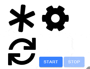
The library also supports animations. In this example, the first two icons use built-in animation names, and the second row toggles an animation with Angular state.
Note that these animations do not run when the operating system or browser is configured with prefers-reduced-motion: reduce.
  <div>
    <fa-icon [icon]="['fas', 'asterisk']" animation="spin" size="6x" />
    <fa-icon [icon]="['fas', 'cog']" animation="spin-pulse" size="6x" />
  </div>

  <div>
    <fa-icon [animation]="syncRunning() ? 'spin' : undefined" [icon]="['fas', 'sync']" size="6x" />
    <ion-button (click)="syncRunning.set(true)" [disabled]="syncRunning()">Start</ion-button>
    <ion-button (click)="syncRunning.set(false)" [disabled]="!syncRunning()">Stop</ion-button>
  </div>
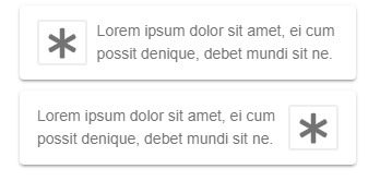
The border option draws a frame around the icon. If you want text to flow around the icon, pull handles that layout.
  <ion-card>
    <ion-card-content>
      <fa-icon [border]="true" [icon]="['fas', 'asterisk']" pull="left" size="2x" />
      Lorem ipsum dolor sit amet, ei cum possit denique, debet mundi sit ne.
    </ion-card-content>
  </ion-card>

  <ion-card>
    <ion-card-content>
      <fa-icon [border]="true" [icon]="['fas', 'asterisk']" pull="right" size="2x" />
      Lorem ipsum dolor sit amet, ei cum possit denique, debet mundi sit ne.
    </ion-card-content>
  </ion-card>
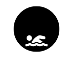
With masking, you can combine two icons into a single monochrome shape. The transform input lets you position the foreground icon precisely inside the mask.
  <div>
    <fa-icon
      [icon]="['fas', 'swimmer']"
      [mask]="['fas', 'circle']"
      size="6x"
      transform="shrink-10 down-4"
    />
  </div>
Stacking places multiple icons on top of each other.
  <div>
    <fa-stack size="5x">
      <fa-icon [icon]="['fas', 'camera']" stackItemSize="1x" />
      <fa-icon [icon]="['fas', 'ban']" stackItemSize="2x" style="color: Tomato" />
    </fa-stack>
  </div>

Layers give you more control when combining icons, text, and counters.
  <div>
    <fa-layers size="6x">
      <fa-icon [icon]="['fas', 'play']" transform="rotate--90 grow-2" />
      <fa-icon [icon]="['fas', 'sun']" [inverse]="true" transform="shrink-10 up-2" />
      <fa-icon [icon]="['fas', 'moon']" [inverse]="true" transform="shrink-11 down-4.2 left-4" />
      <fa-icon [icon]="['fas', 'star']" [inverse]="true" transform="shrink-11 down-4.2 right-4" />
    </fa-layers>
  </div>

  <div>
    <fa-layers size="5x">
      <fa-icon [icon]="['fas', 'cloud']" />
      <fa-layers-text content="Cloud" style="color: white" transform="shrink-12" />
    </fa-layers>
  </div>

  <div>
    <fa-layers size="5x">
      <fa-icon [icon]="['fas', 'envelope-open']" />
      <fa-layers-counter content="5" />
    </fa-layers>
  </div>


Finally, you can bind a style object to an icon and update it from TypeScript. This is useful when colors, stroke widths, or opacity change at runtime.
  <div>
    <fa-icon [icon]="['fas', 'bell']" [style]="solidBellStyle()" size="5x" />
    <fa-icon [icon]="['far', 'bell']" [style]="regularBellStyle()" size="5x" />
  </div>
  solidBellStyle = signal(this.createRandomIconStyle());
  regularBellStyle = signal(this.createRandomIconStyle());

  private intervalId: ReturnType<typeof window.setInterval> | undefined;

  ngOnDestroy(): void {
    if (this.intervalId !== undefined) {
      window.clearInterval(this.intervalId);
    }
  }

  ngOnInit(): void {
    this.intervalId = window.setInterval(() => {
      this.solidBellStyle.set(this.createRandomIconStyle());
      this.regularBellStyle.set(this.createRandomIconStyle());
    }, 1000);
  }

  updateMagicLevel(event: Event): void {
    const magicLevel = Number((event.target as HTMLInputElement).value);
    this.magicLevel.set(magicLevel);
    this.magicTransform.set(`rotate-${magicLevel}`);
  }

  private createRandomIconStyle(): {
    color: string;
    'stroke-width': string;
    opacity: string;
    stroke: string;
  } {
    return {
      color: this.randomColor(),
      stroke: this.randomColor(),
      'stroke-width': `${this.randomWidth()}px`,
      opacity: Math.random().toString(),
    };
  }

Visit the Angular Font Awesome project for the full API and the latest integration notes.
The source code for the examples in this blog post is hosted on GitHub.